Project:
ERP / US Pharmeceutical Company / Deloitte / SoftServe
Date:
Apr 2019
Prerequisites And Input
The work was done for Deloitte providing a SaaS to a US-based pharmaceutical company to manage their operations (tracking of shipping, payments, refunds, rebates, bundles, contracts etc.). The app was split into 7 modules each having their own small dedicated team including a product owner on-site and offshore development staff (Back-end, Front-end, BA, UX, QA). The product owner along was responsible for gathering user feedback and with the lead designer actionable insights.
The Problem
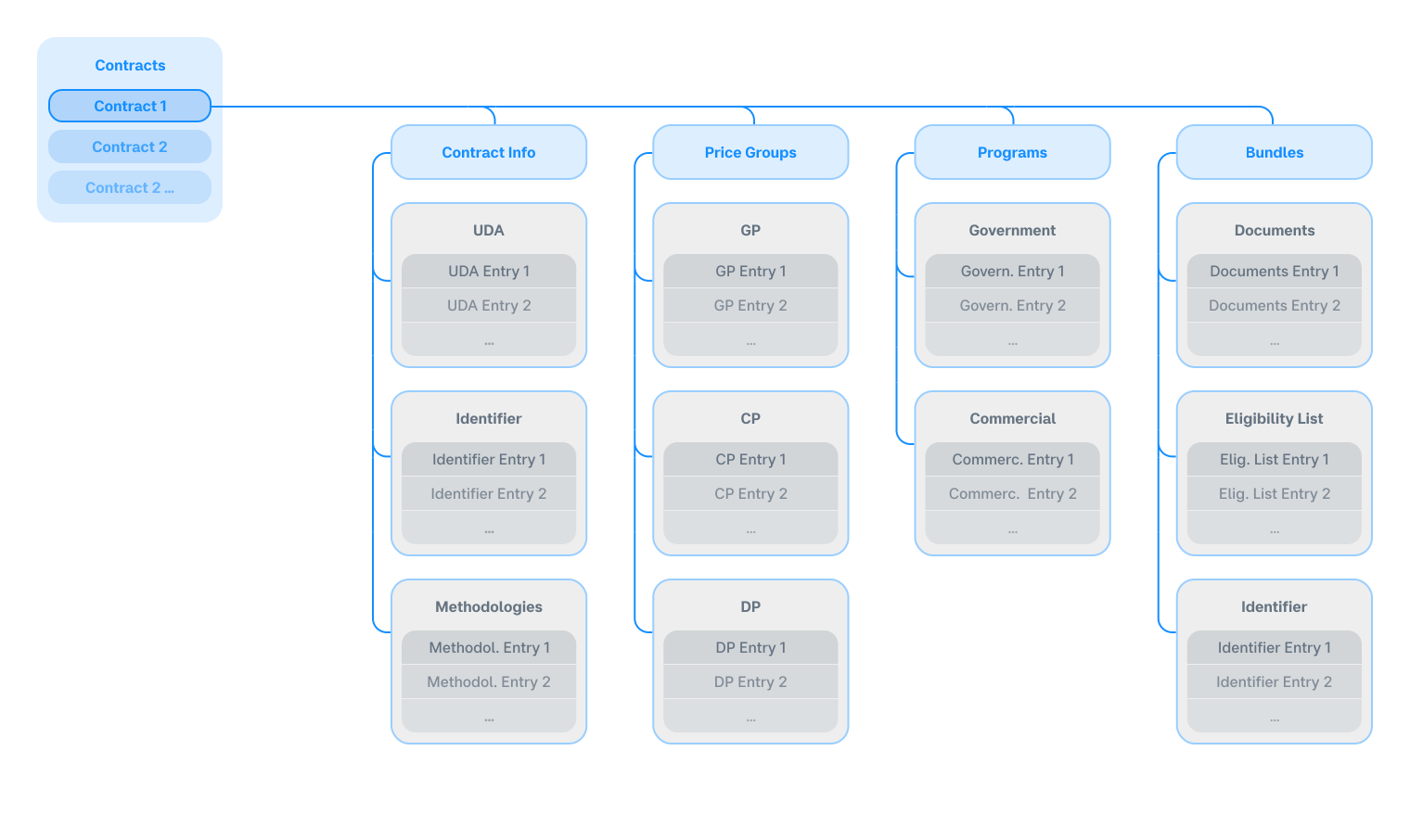
The product mental model reflected the massive scale of the operations with massive amounts of data with multi-level nesting. A typical clerk working for the final client every day received documents (called “contracts” internally in the app), which in the UI had a 3 level nesting inside of it. Below is the approximate schematic of the data tree inside the so-called contract.
Below is how a contract looked inside (with nested and branching data UI switches highlighted in green).
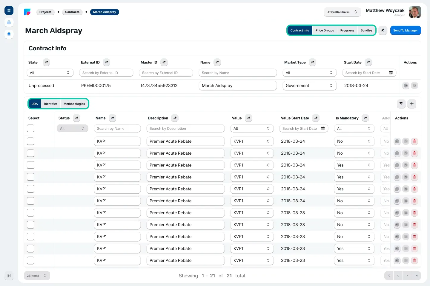
A typical clerk working for the end-client receives dozens of documents like this in a day, and a processing requires to delve several levels deep inside each and one of them and manipulating some of the related/nested data, so the problem that the product owner formulated was kind of obvious, and the feedback from the users gave it enough momentum to be prioritized and tackled. The problem: “scattered and deeply nested data take too much time to process with the available tools”.
The Research
But what are the available tools? The app utilized very powerful commercial library to work with spreadsheet layouts — AG Grid. And a plethora of small, quality-of-life kind of features that reduced friction when editing data in bulk, below is and example of such feature — combining the row selection with data editing pastes the value inside the similar data type (the same column) inside the selected rows, with clear indication what is changed and undo buttons.
Both AG Grid and existing editing tools allow for frictionless bulk-entry of data, but it doesn’t solve the scattering problem. But what are typical ERP/CRM SaaS in their essence? At the core majority of the ERP/CRM SaaS is just a convenient GUI that convert user interaction into a SQL query, so, the feature that is needed was basically already there.
The Limitations
The app already had a filter that was used extensively by the end-client’s employees for a quick RUD sweeps of the header data. Reconstructing it around a new feature would probably introduce more friction than it will remove, at least for a starting period, before the users catch on. Also, the existing filter had no back-end logic of its own.
The Solution
With all the features offered and limitations imposed by both the tech stack and the design system, the feature was designing itself at this point. The core mechanics are the following: user selects the high level header records (contracts) and initiates the widget. The widget allows gathering the nested data of these selected high-level records all in one place.
At the top we have header/parent data that the user selected prior to starting the widget, so the user always know what he is actually editing at the moment.
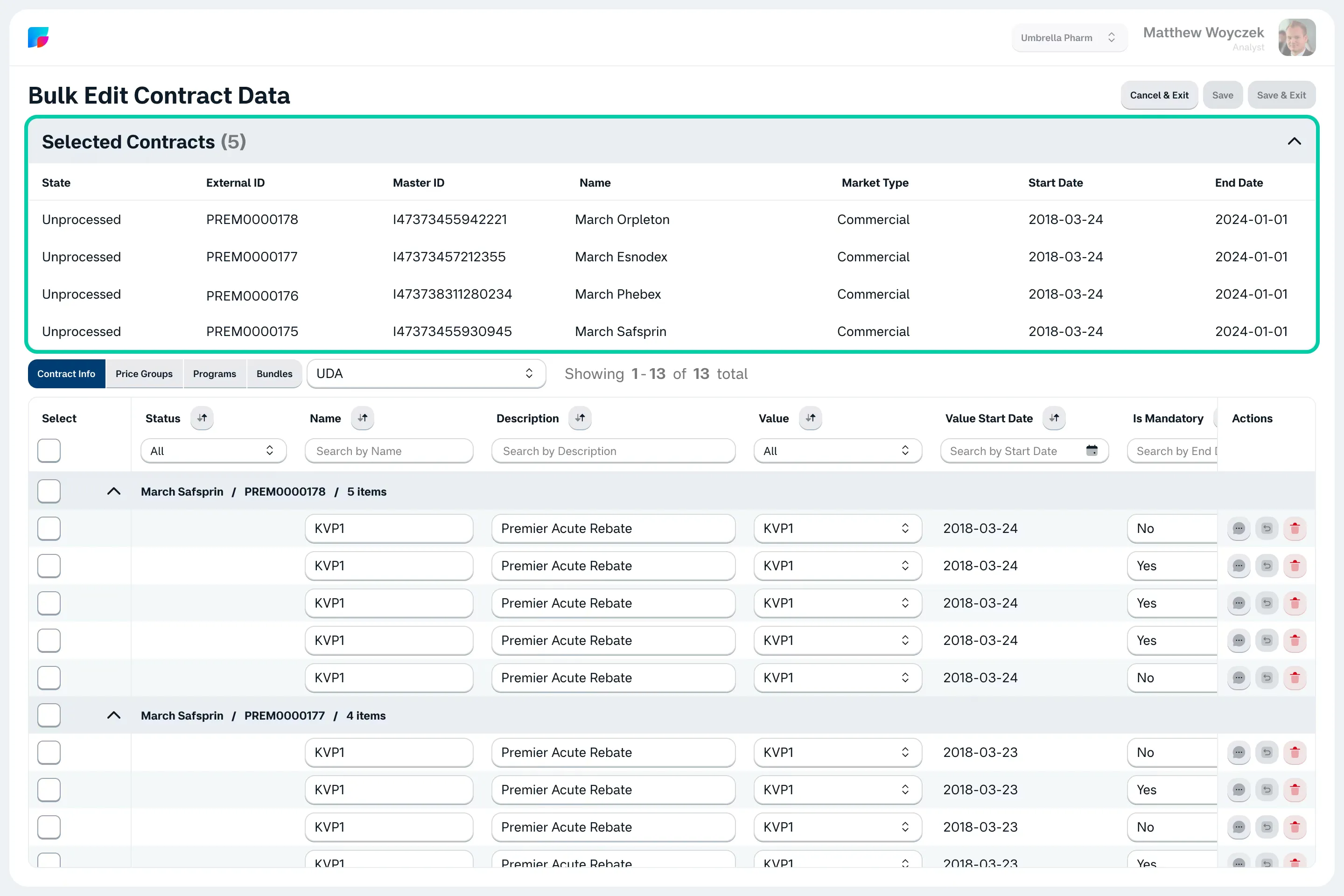
… collapsible to give the user as much space as possible
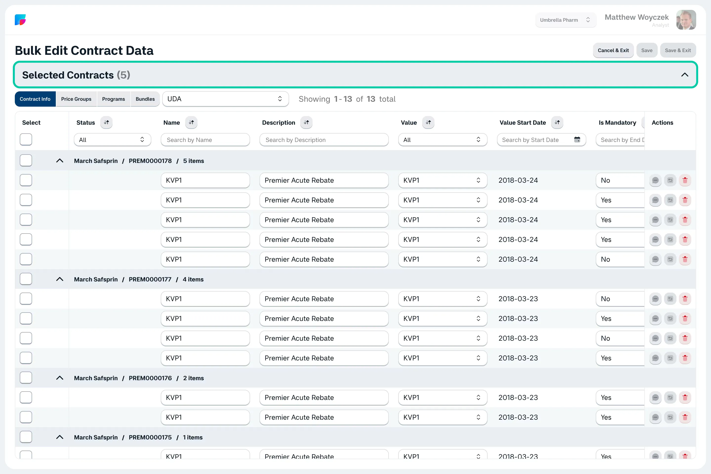
In the middle there are the nested branch selectors
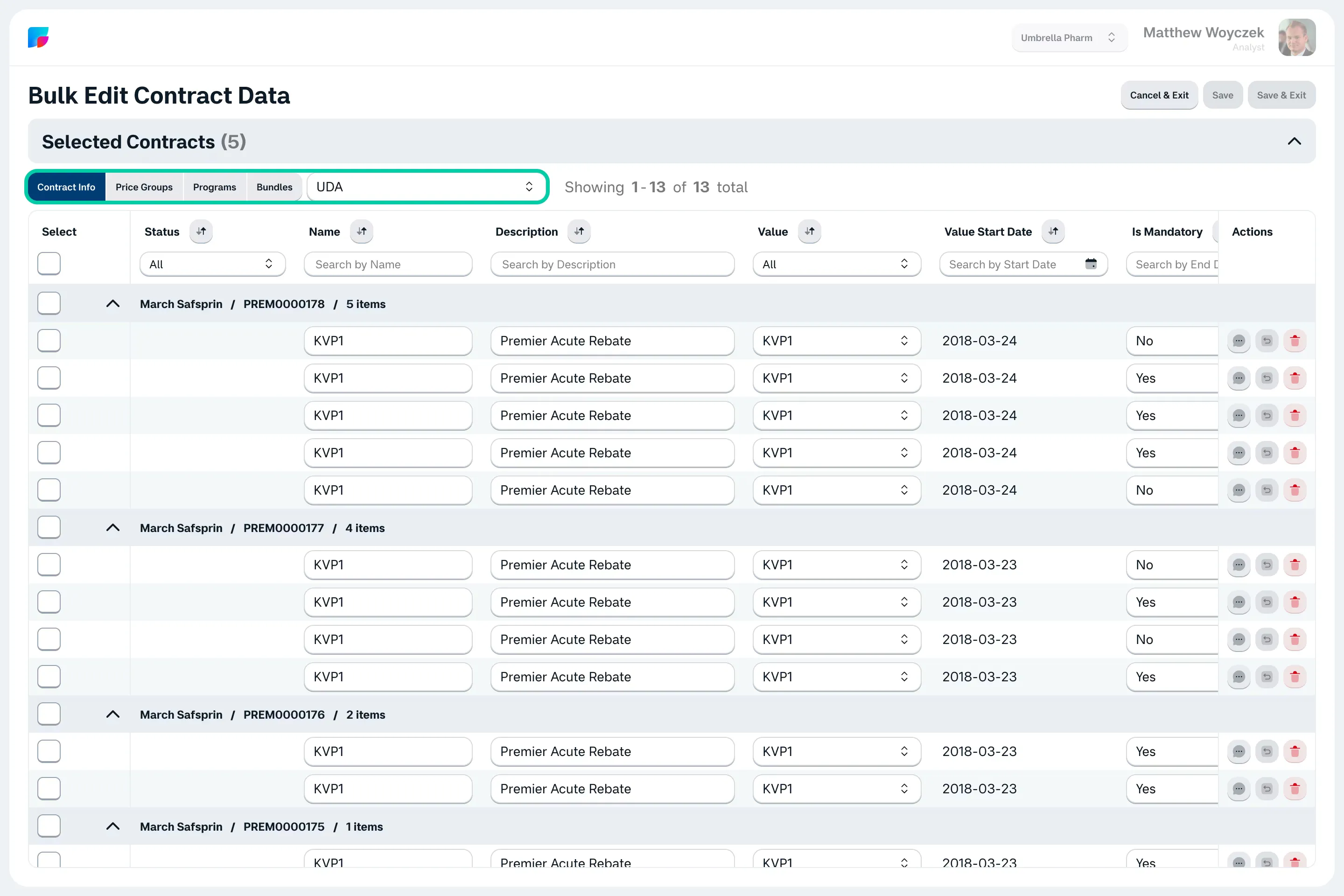
At the bottom there are the low level data display
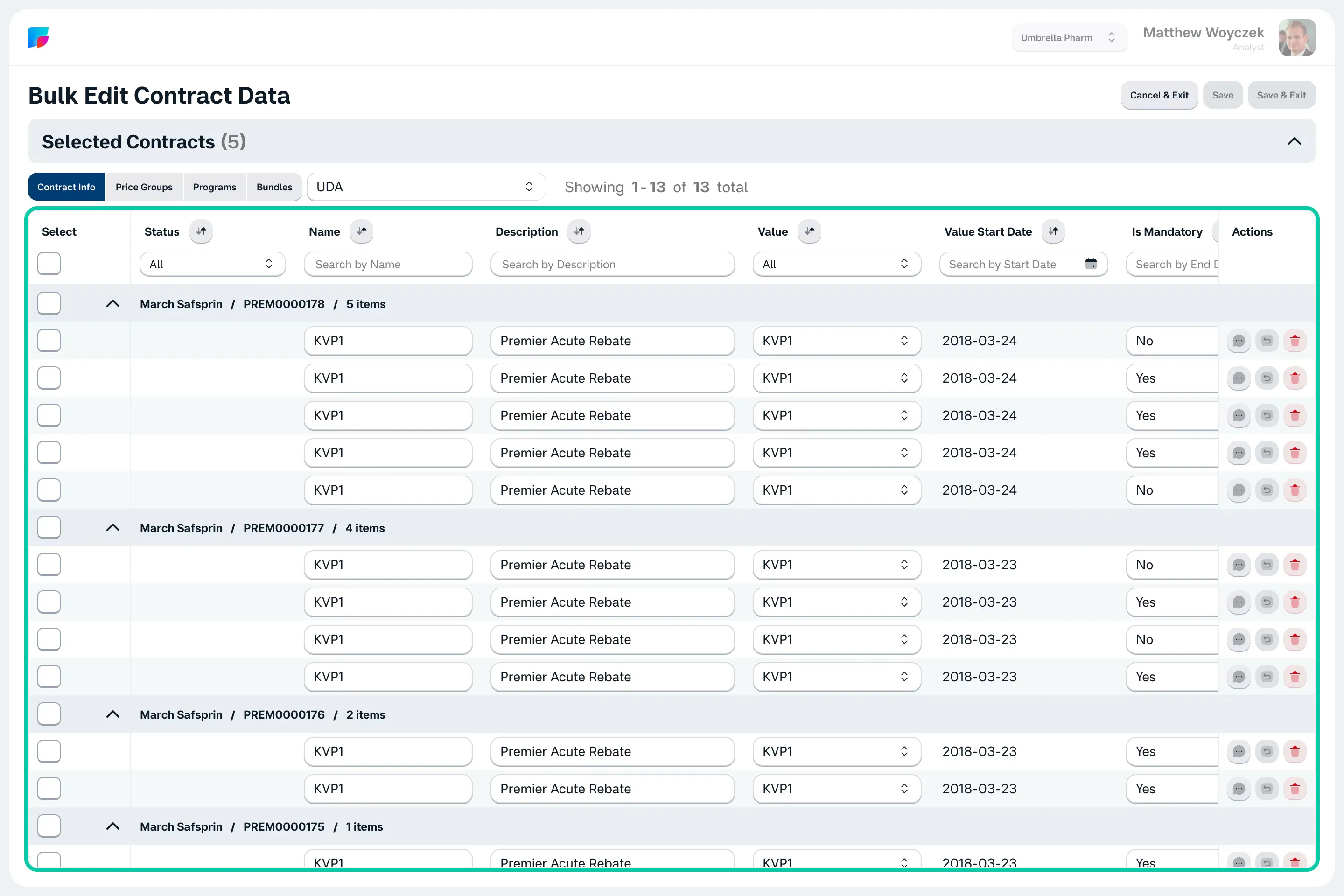
… neatly divided onto groups with the name corresponding to the header/parent record the data was taken from. Also, collapsible.
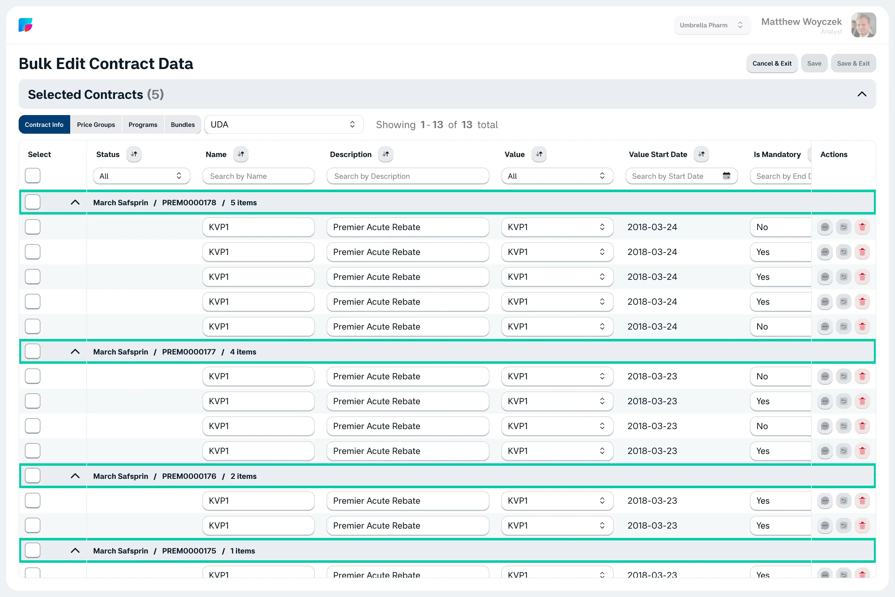
For comparison. Here’s how quickly a user would do a single pass on a single contract the old way:
And here’s how a user would do a pass of 4 contracts at once with this new widget:
As you can see on this small example there is already a 4-fold increase in processing speed, but since there are already tools at the user’s disposal allowing for a bulk-change of the data, with this new widget, increasing the amount of pre-selected header records will only grow the speed gap between how it is done now vs. how it was done then, and 10X or even 20X increase in processing speed becomes possible.
Conclusions
So with this one UX decision, we achieved the following:
- Up to 20X increase in data RUD operations for the users;
- No new UI components added to the library (except for one small icon);
- Minimum back-end development overhead.
Notes
The visual style of the demonstration mockups don’t match the actual visual style of the app and was drawn from scratch with the following requirements: high data density, clear distinction of clickable elements from non-clickable one, contrast even for placeholder text and disabled UI controls.
All the mock data is all fabricated and not reflect the actual data in any way. And yes, there are easter eggs.